Handing off designs can be pretty stressful for designers since a small mistake in this process can result in hours of reworking for developers. This is true for companies and products of all kinds and sizes. A seamless handoff will significantly minimize guesswork and ensure a frictionless development process.
However, handoffs are full of potential pitfalls that even the most experienced teams are prone to. In today’s article, we’ll take a closer look at the most important things to take care of when handing your design off.
Let’s dive right in, shall we?
What Is a Design Handoff?
The design handoff is a point in the product development process where developers implement the finished design. In order for a handoff to be successful, a good designer-developer collaboration is vital.
But more often than not, this phase doesn’t go as smoothly as it should. Part of the problem is the designer’s perception of the process—many of us tend to think that this is where we reach the finish line, rest on our laurels, and let the developers “do their thing.”This perspective is conducive to a siloed and inefficient collaboration between the two tribes. So, let’s take a look at the things we should do to ensure a more productive designer-developer interaction.
Use a Library
Establishing a sense of continuity in your designs is imperative for a successful handoff. Fragmented design hand-off files and components here in there are a recipe for major headaches and confusion.
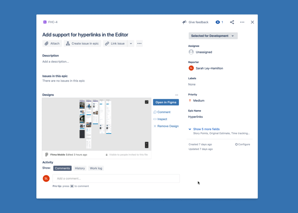
As opposed to sharing individual assets directly with the developers or attaching files to the user stories/tickets/Jira or similar products, have them in a shared library or folder and use the links inside tickets. This will make finding assets significantly easier for developers.
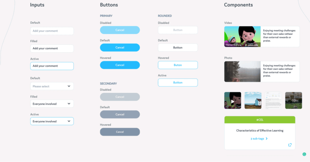
An asset library, which is a part of the design system, should be the single source of reference. In Figma, for example, you can copy a link to a specific asset within the library. This is the link you should share in tickets. Not to mention there’s a plethora of plugins or native integrations among Figma, Sketch, and Adobe Products with project management tools like Jira.
Involve Developers Early
A common issue among teams is the assumption that designers should just drop their designs off to developers and let them figure the rest of it out. A better way of approaching this would be to involve developers as early as possible to provide them with insight into the various behaviors and states you’re working on. Otherwise, you might design something that’s not feasible to code, which is synonymous with wasting time.
Here are a few recommendations to ensure a smoother and more seamless handoff:
- If possible, include developers in calls with clients and stakeholders if they’ll be able to gather some essential insight about the product;
- Communicate with developers to learn how design elements would end up being transferred to the end-product;
- Consult with developers during early prototyping to avoid any potential code-related issues later on;
However, sometimes, if developers have a pre-established framework, it’s best to give them the freedom they need and take a look at the implemented version first, rather than insisting on your particular design decisions that may be complicated to implement.
It should also be noted that involving developers too much can also be an issue. In my experience, you can easily overwhelm developers at the ideation stage, since there are a lot of different concepts and changes, all of which might have their own technical caveats.
That said, you should seek to strike a balance between keeping developers engaged and overwhelming them with concepts.
Static vs. Dynamic Handoffs
There’s a case for both static and dynamic handoffs. The former implies that you’ll present your design ideas via basic illustrations. On the other hand, the latter comes with more specific requirements for interactions and overall user experience.
Making the right decision in this regard is relatively simple—make sure to have an open and transparent interaction with the developer team.
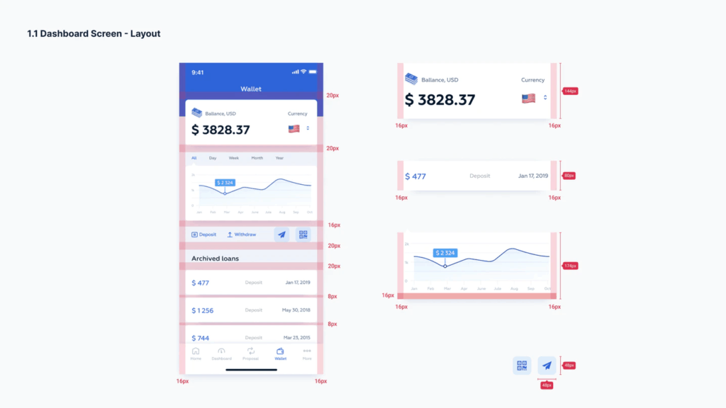
Static handoffs are useful when the developers aren’t versed in Figma, Zeplin, or similar products. As a result, they might not intuit what information or specs they need to grab. What static handoffs provide is the ability to explicitly highlight essential information such as margins, paddings, font sizes, etc.
That said, static handoffs sometimes create more problems than they solve. The primary issue is the fact that this type of handoff requires a lot more time, since you have to do manually what Figma, for example, does for you automatically, which is marking distances among elements. Another challenge that is otherwise avoidable is the hassle with marking versions and changes, introducing layers of taxonomy, etc. As such, before committing to a static handoff, make sure the pros outweigh the cons.
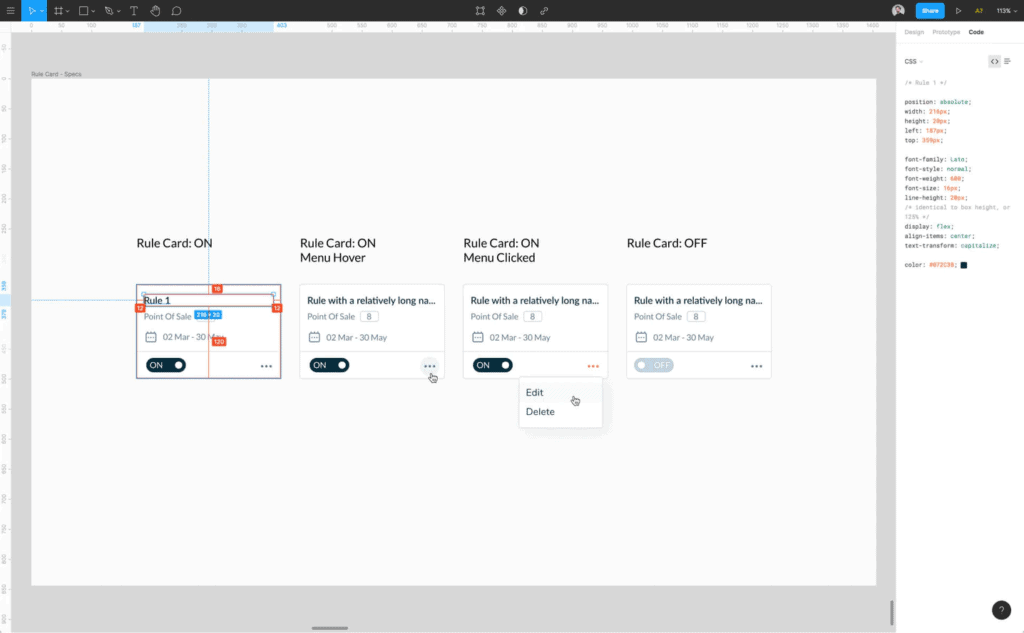
When using dynamic handoffs, date the iterations and don’t change already shared designs, at least not without explicit communication with developers and a project manager or product owner. It’s very tempting to just update the same shared design and file, but that leads to confusion, especially when those links and files are in a user story. You, as a designer, can’t be certain that developers know what’s been changed and where. For all you know, they might be midway into the implementation.
SVG Is King
SVG is a vital format for defining vector-based graphics. It’s very handy when looking to increase development speed when working on projects that deal with a fair share of animation and design. Furthermore, SVG graphics use up less space, which is very useful in the long run.
Here are a few essential benefits that should motivate you to choose SVG over any other format:
- When it comes to handoffs, size matters. Since SVG is pretty much XML code, files in this format are extremely lightweight. There was even a report suggesting that you can save up to 80% of bandwidth by switching from PNG to SVG. As a result, your products will load faster, which is conducive to a satisfying experience;
- SVG files can scale with no distortion. Respectively, these files can be used for anything from watches to giant outdoor banners without compromising quality during the resolution scaling;
- Given that these files have the styling information incorporated, this allows developers to create pixel-perfect prototypes without needing a stylesheet;
- Lastly, because an SVG is basically code, they’re fairly easy to edit or animate for developers, which eliminates the need for a designer to create multiple versions or states of the same element.
Avoid Doing the Work Twice
Creating a sense of continuity and consistency in your design library will benefit both you and the developer team substantially. Products like Storybooks, Figma, and Sketch are valuable tools that allow achieving this. What these products do is enable us to break the barriers between designers and developers by linking code to design elements.
Storybook, for instance, allows developers to access all the components in an organized manner. As a result, they’ll be able to use, share, and test all the elements in your design. Taking the time to merge your design with code via storybooks will save both you and the developers a lot of time.
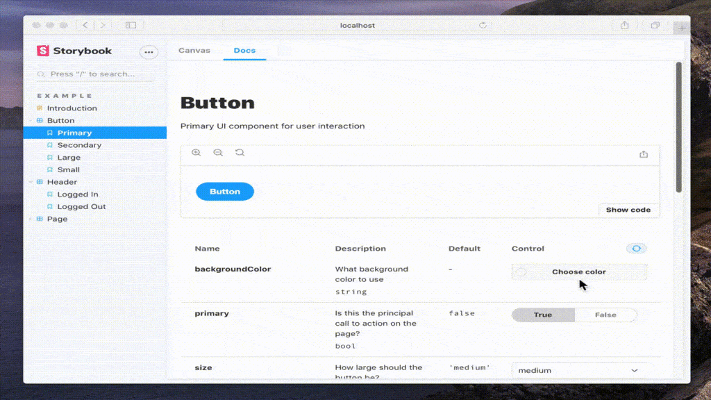
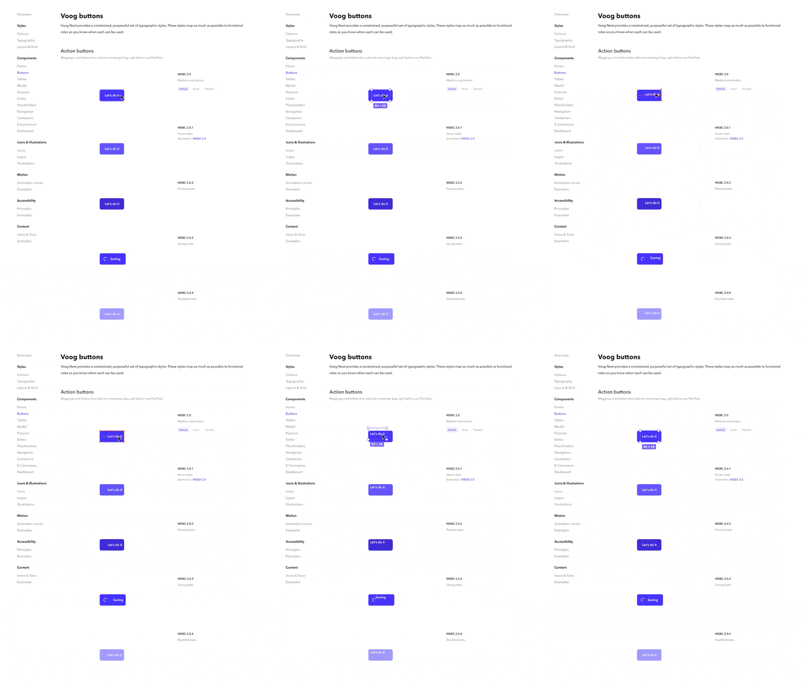
The same goes for Figma, Sketch, and Adobe XD. All of these tools allow creating a design system, which, in practical terms, is either a separate page or a separate file with symbols (in Sketch) or components (in Figma). What components and symbols do is allow you to make global changes in all instances of a certain element. Say, you want to make all calls to actions green instead of blue—it’s as simple as a few clicks.
Conclusion
Great products rely on a great handoff. While this may often seem like a very technical process that enters waters that we don’t necessarily understand (front-end development), it’s essential that we take the time to learn how to do it. Furthermore, some of the facets of this process have nothing to do with code. They revolve around communication and productive collaboration.
This article first appeared on UX Mastery and is republished here under a Creative Commons license.


0 comments:
Post a Comment